Sometimes flying isn’t the scariest part of a holiday, it’s when you land and after standing around the conveyor belt for 30 minutes, you have the horrible realisation that your luggage didn’t make it.
So I set out to see how I can improve the travel experience by providing transparency around the transportation of people’s luggages.
To find out whether I’m solving the right problem, I had to define my problem then do further research to either validate my hunch or reposition my problem framework.
“How can we give passengers peace-of-mind when travelling with their luggage so they can focus on the things that matter?”
Research
Is my problem even a problem?
Using a variety of research methods (interviews, desk research and competitor analysis) I gathered data which influenced how I would build my solution and the features that would be included such as looking
at how existing solutions tackled this issue.
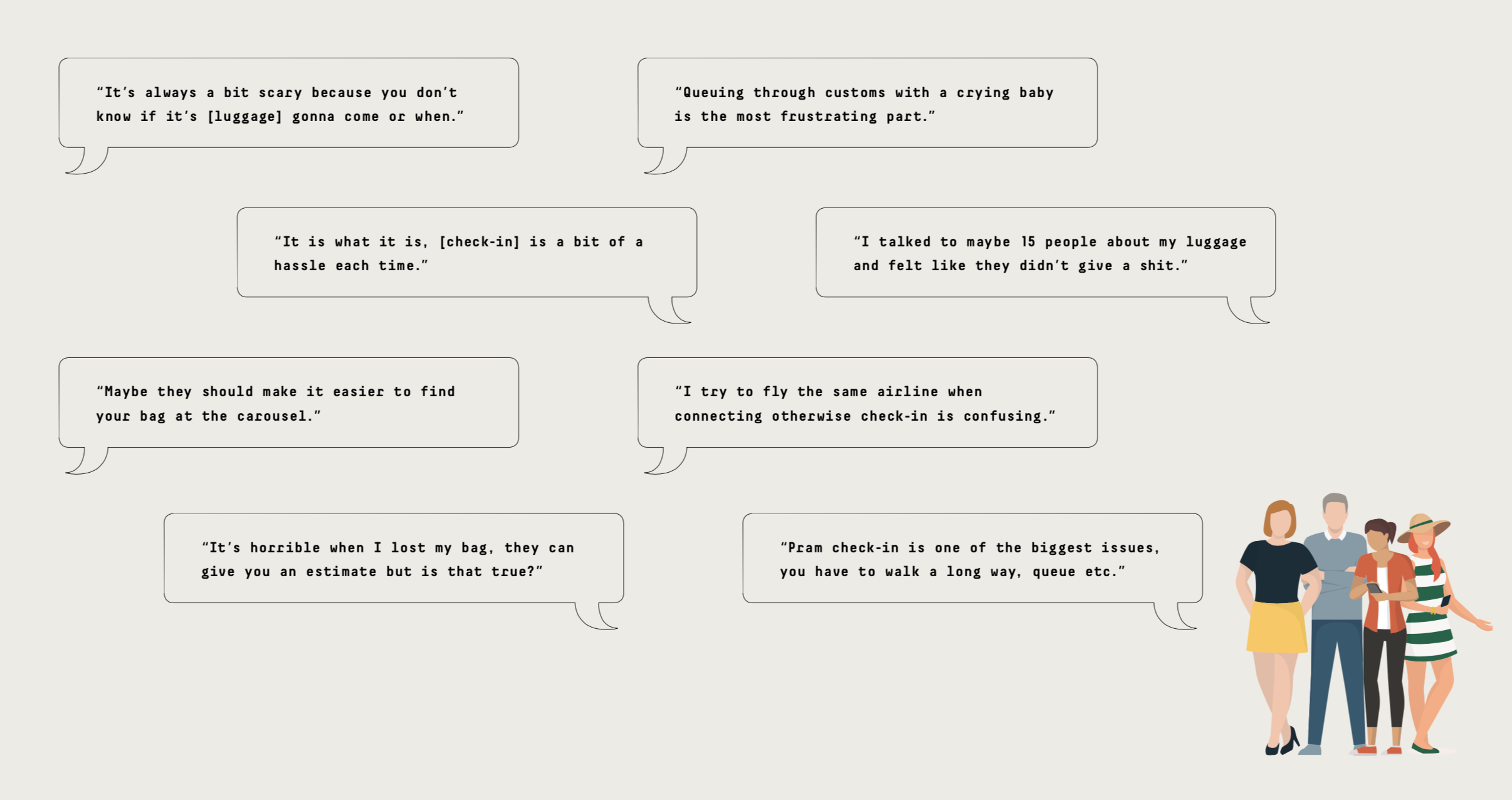
When conducting my interviews, I’ve learnt techniques for uncovering better insights into whether luggage was a concern to the user and if so, what they did to alleviate their concerns.
One of the methods was to research “both sides of the same coin” (the coin being the luggage transfer experience) by interviewing a baggage handler who helped facilitate the experience and passengers who received the experience.
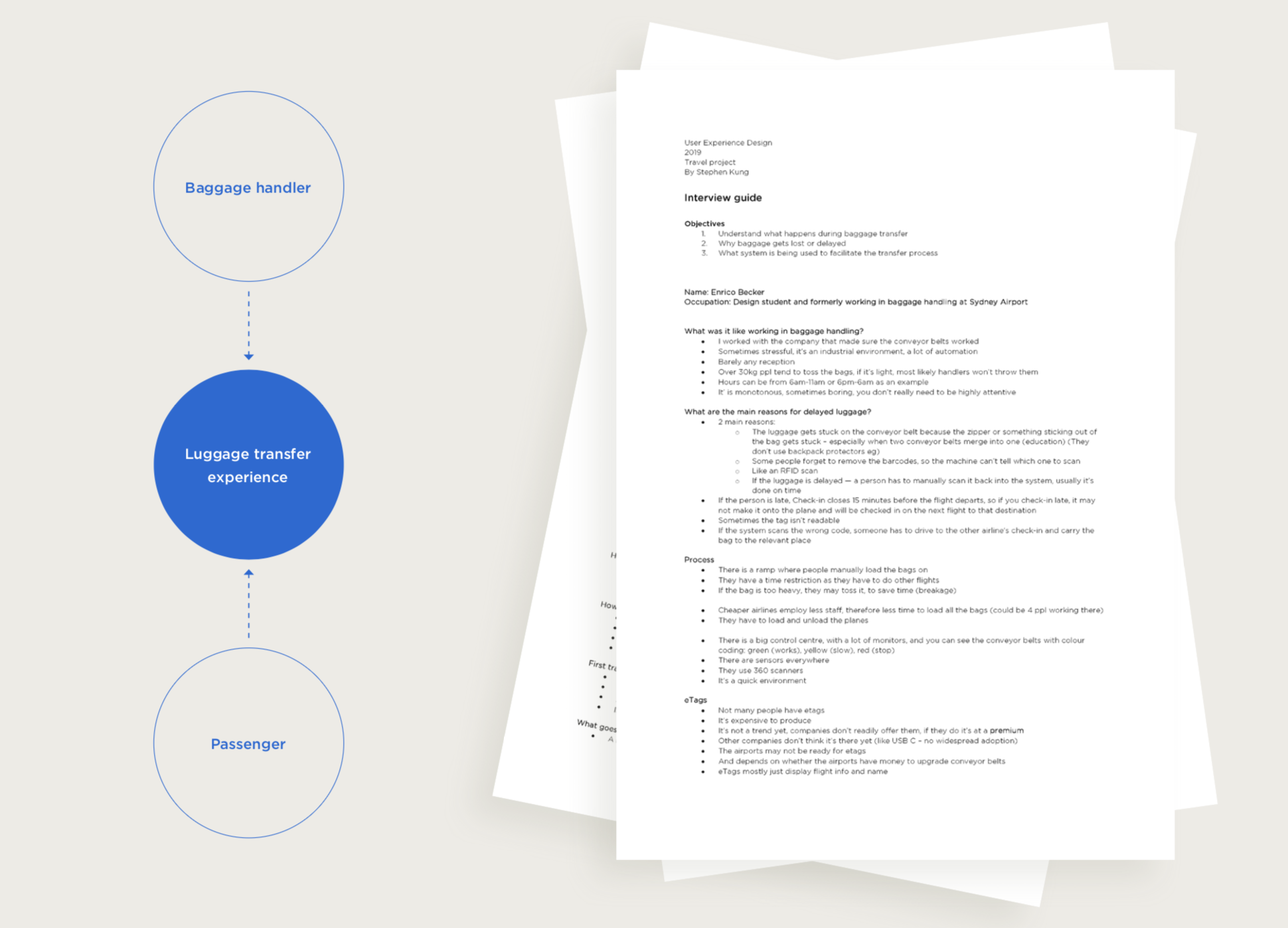
Designing the interview.
To ensure I got the most out of the interviewees, I drafted an interview guide and planned the stages of when to ask specific questions. I also made sure I kept my research objectives in mind.
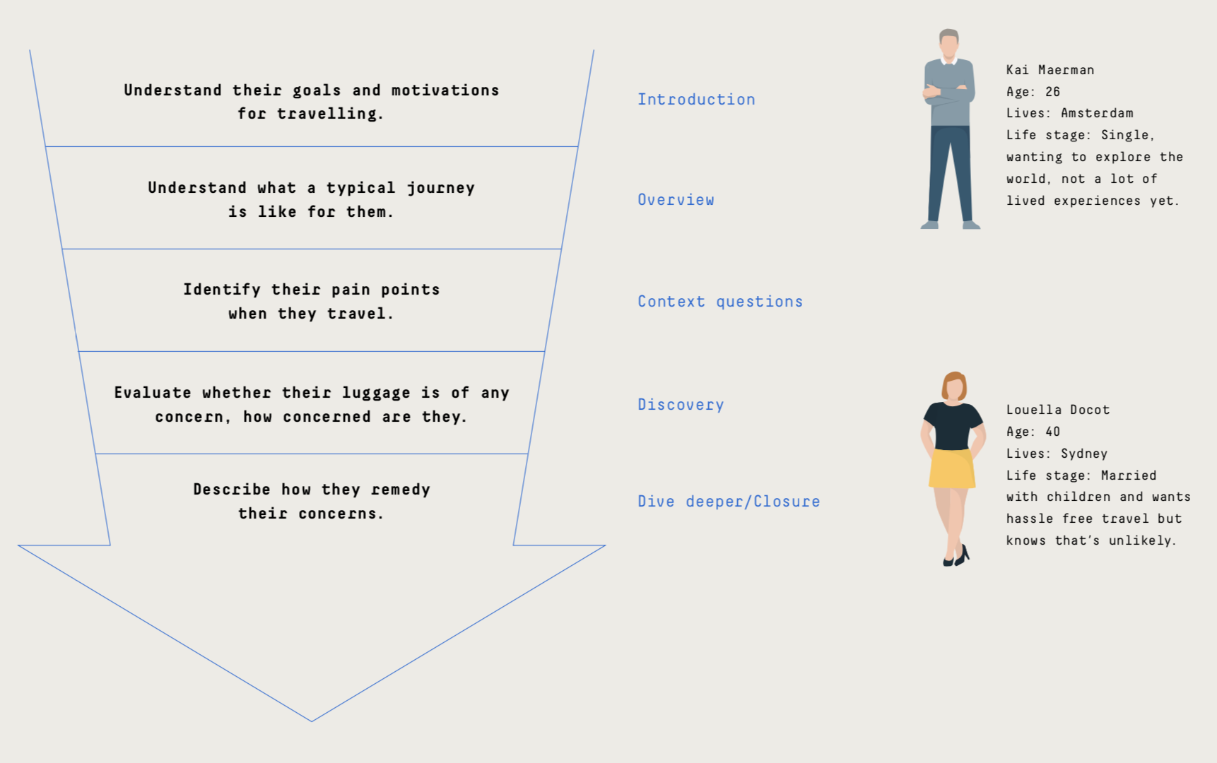
Briefly laid out, is the idea of how I wanted the interview to run, in order to ascertain what problems travellers faced, whether baggage was an issue and if so, how did they seek to remedy it.
Analysis
Mapping is a powerful technique
To position myself in the customer’s frame of mind, empathy maps were created based off common travellers: a mother and a solo traveller.
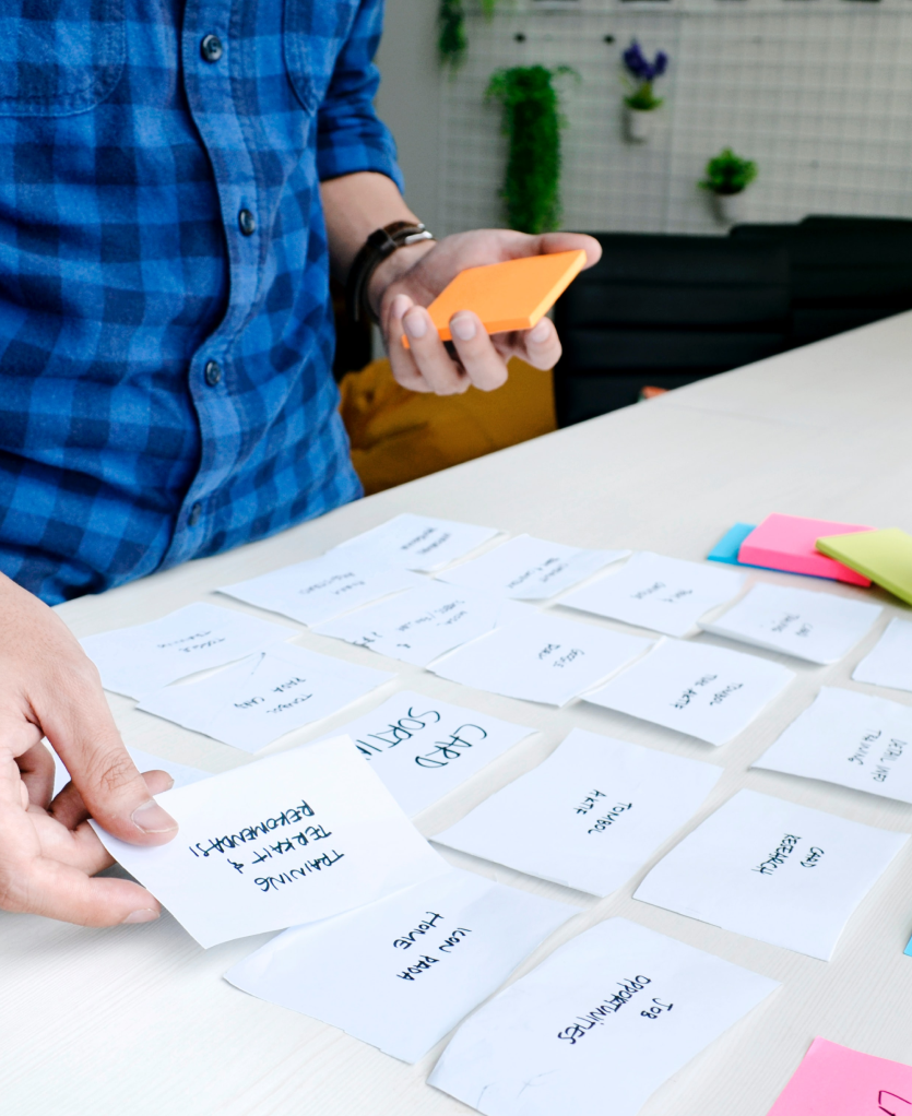
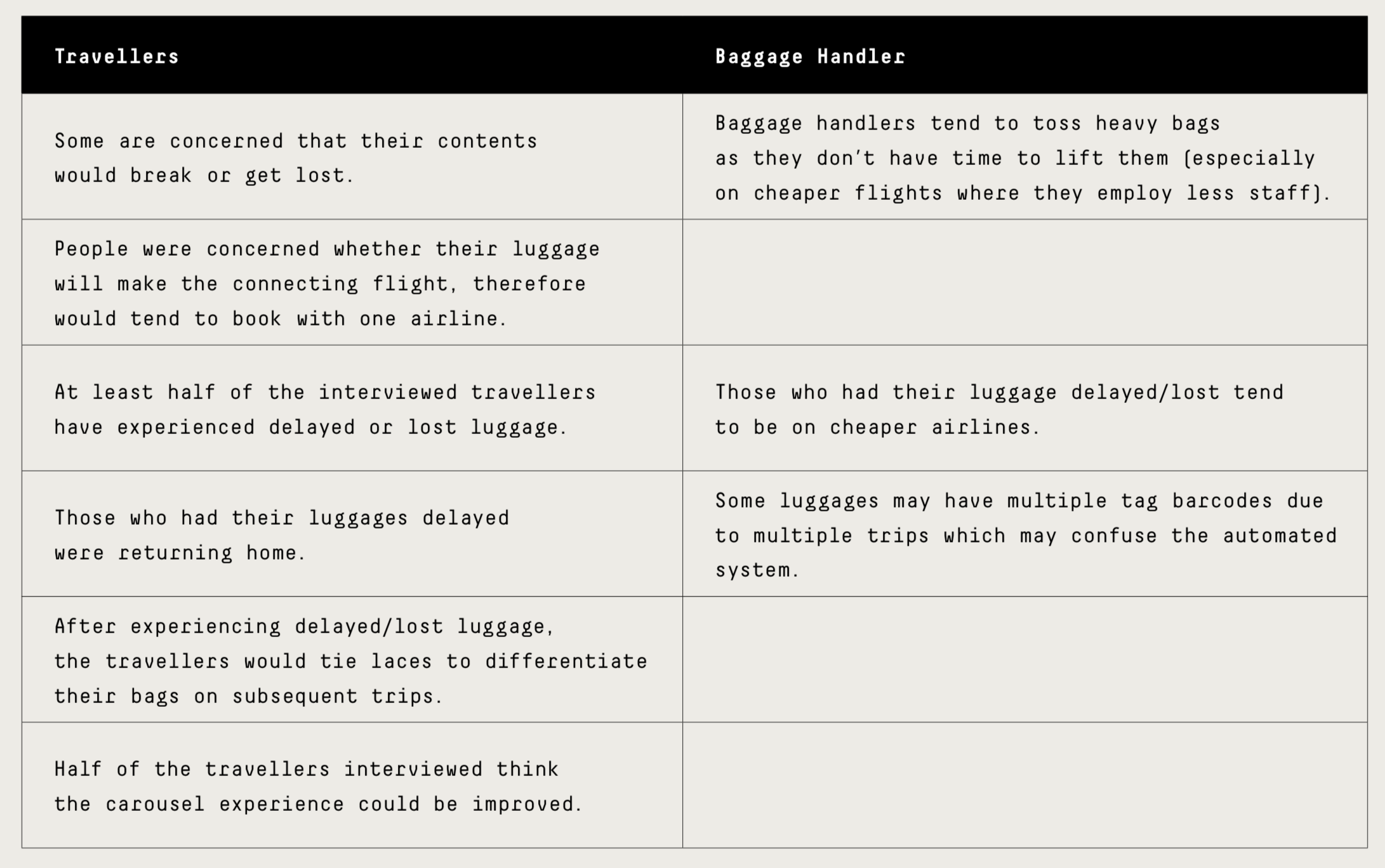
I was able to uncover insights from the interviews using affinity mapping which grouped data into common threads and importantly, I was able to find patterns between what the passengers and the baggage handler has said (Shown in the image below).
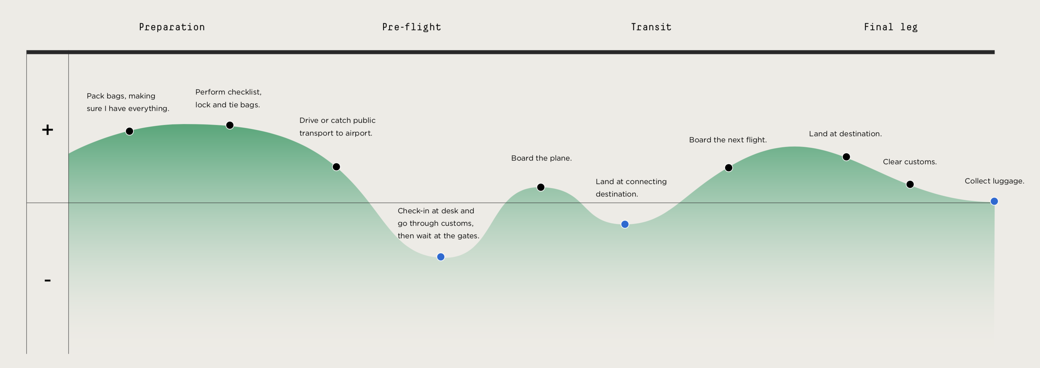
Pairing the insights from the affinity mapping exercise and creating a high level customer journey map allowed me to pinpoint where to focus developing my solution.
Extracted insights that defined my goals
Based off the insights, I thought about what success looks like in this context and what my goals are, and that is:
- To reduce stress and anxiety around luggage transfers by providing transparency and reassurance to passengers at the right time.
- Managing their expectations by making it as smooth as possible should they need to reclaim luggage.
User stories to help project stay grounded
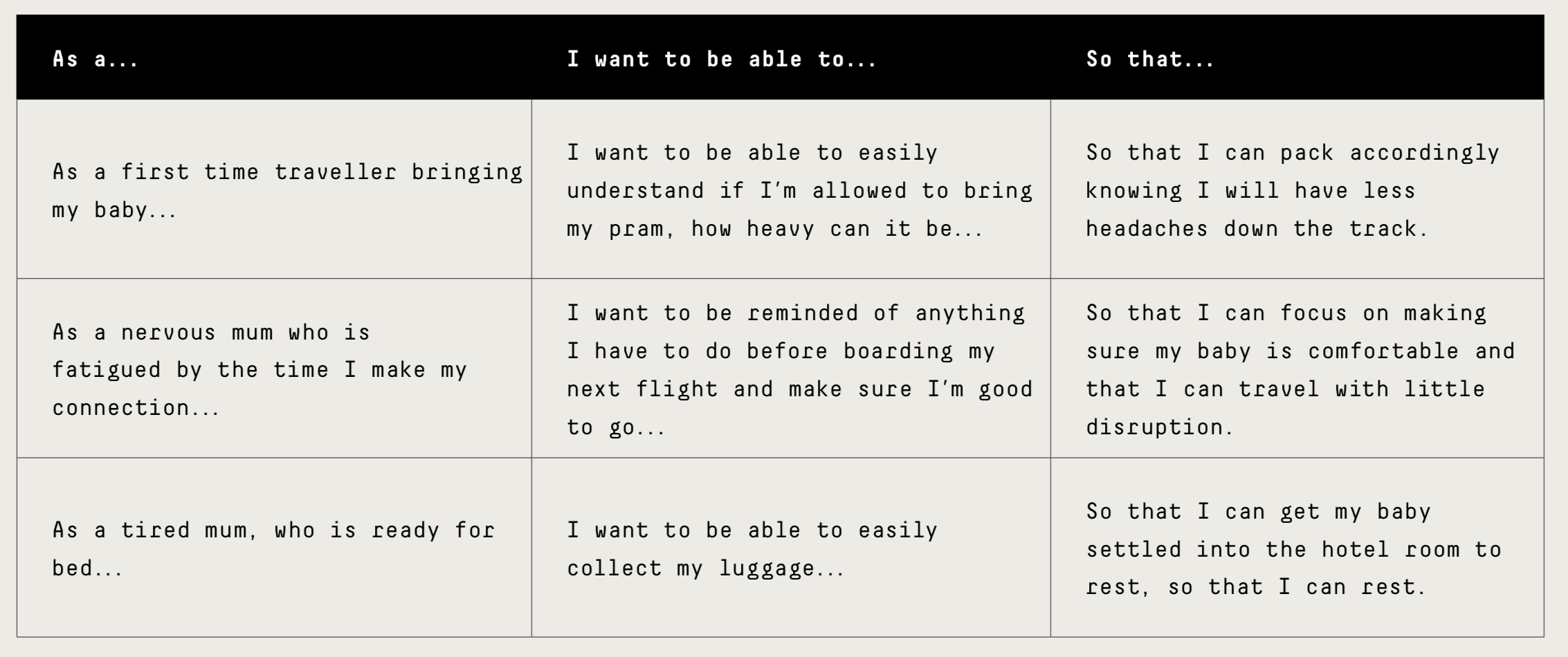
To recap, after gaining insights into my problem and mapping areas of opportunity, I make sure I design with the traveller in mind, and create features through the User Stories framework, after which, I will incorporate these into the wireframes.
Wireframing
Initial wireframing (Iteration V1.0) helped visualise and organise how I would design the solution.
Then I did user testing with someone who has travelled to get feedback on whether the user flow made sense, if there was anything missing and how complicated or simple the solution was.
Based on early stage user feedback, I redesigned the next iteration (Iteration V2.0) which focussed on usability and visual design (such as hierarchy of elements).
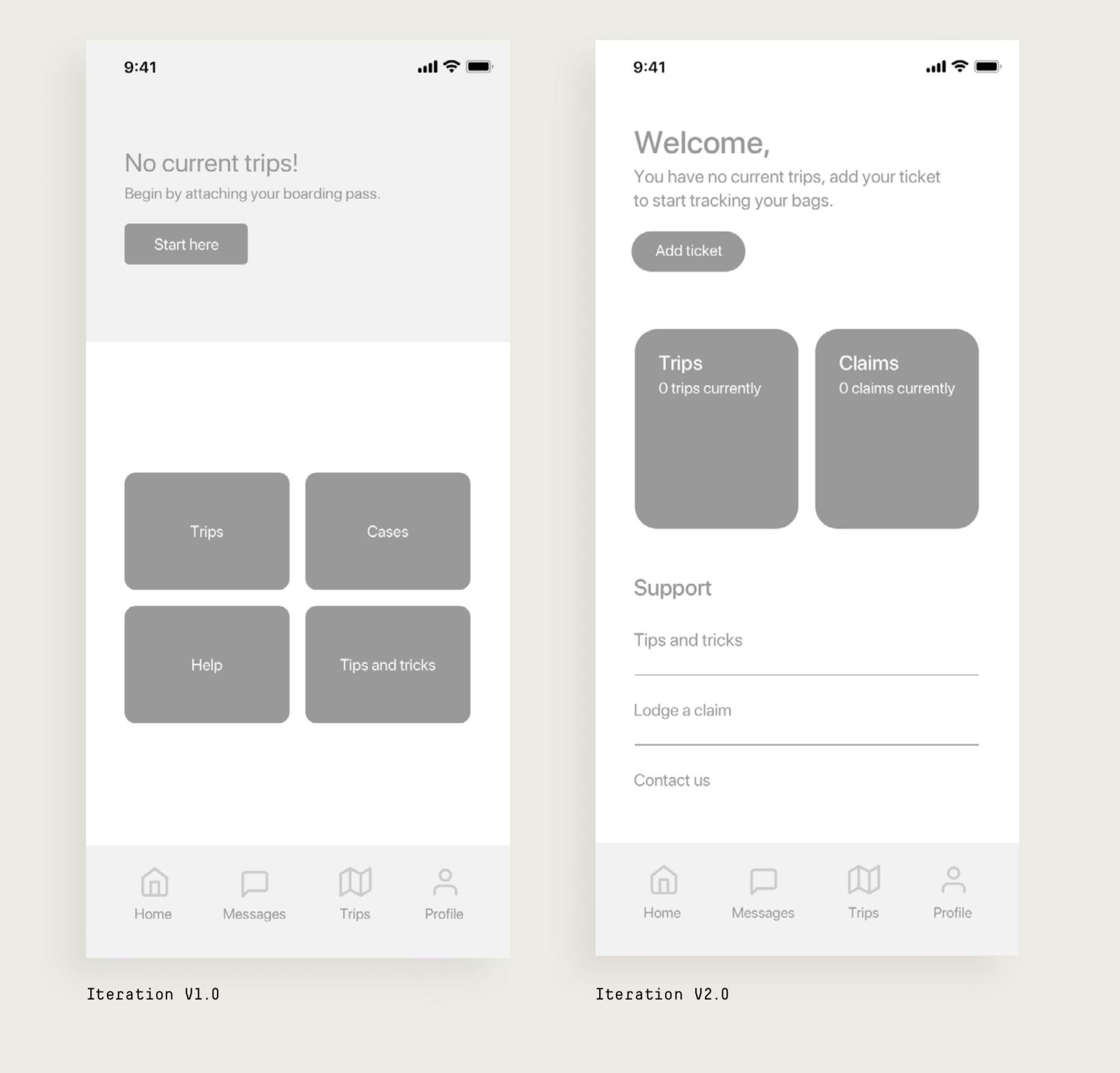
User testing notes
The first round of user testing identified that users were not interacting with the top-half of the screen and that the hierarchy wasn’t clear enough.
In addition, the copy used sometimes would confuse the user. Iteration V2.0 solves this by separating the information by giving each section a different visual treatment and the copy was improved to draw attention to the necessary areas.
Addressing the goals and opportunities Based on the research, I had 2 goals:
To reduce stress and anxiety around transfers by providing transparency and reassurance to passengers at the right time.
Managing their expectations by making it as smooth as possible should they need to reclaim luggage.
The customer journey map also highlighted the main areas to target:
- Check-in.
- Connecting flight.
- Luggage collection.
How did I design the solution:
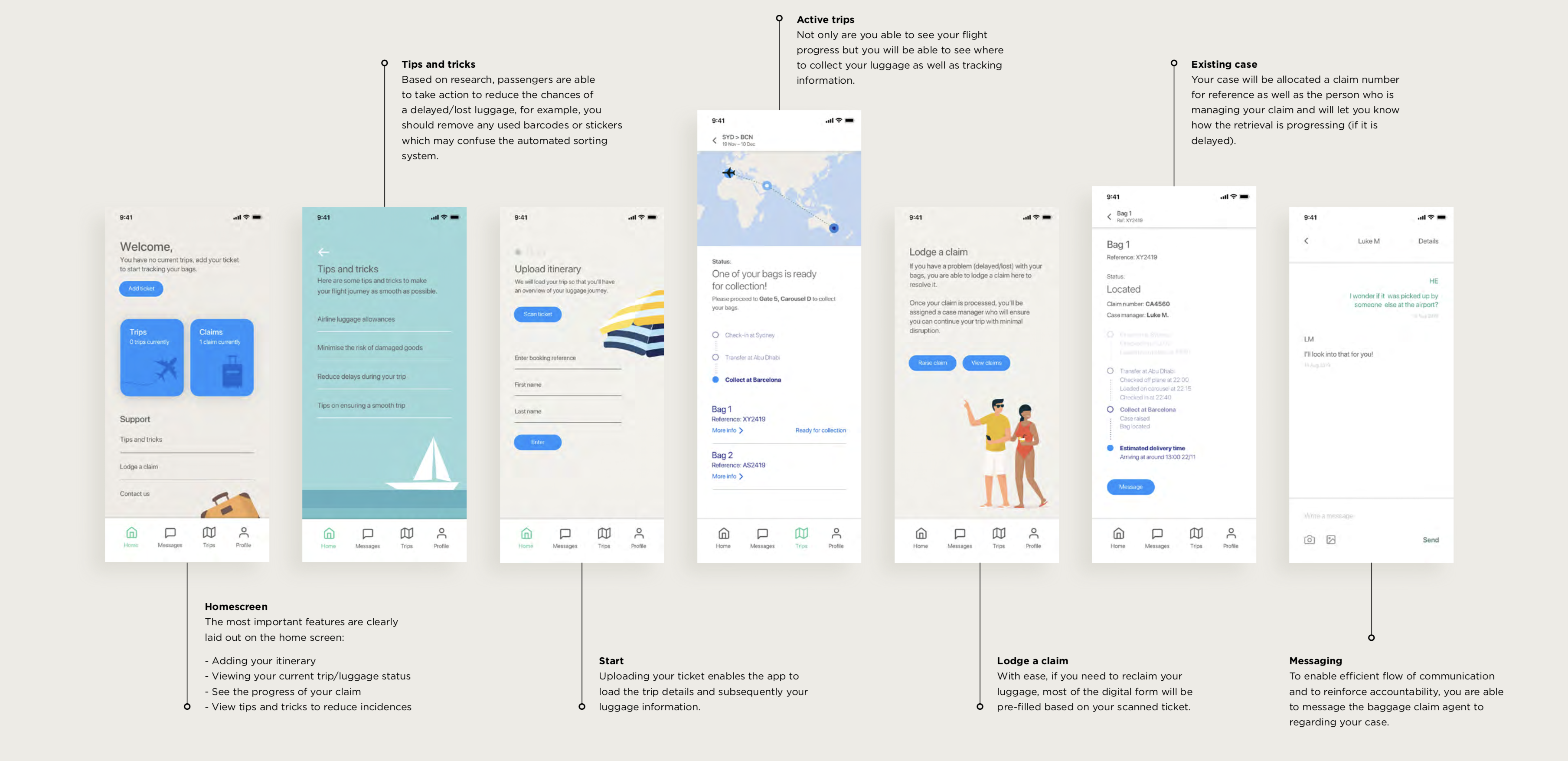
The app reduces stress/anxiety by providing tracking information on the whereabouts of your luggage at appropriate times.
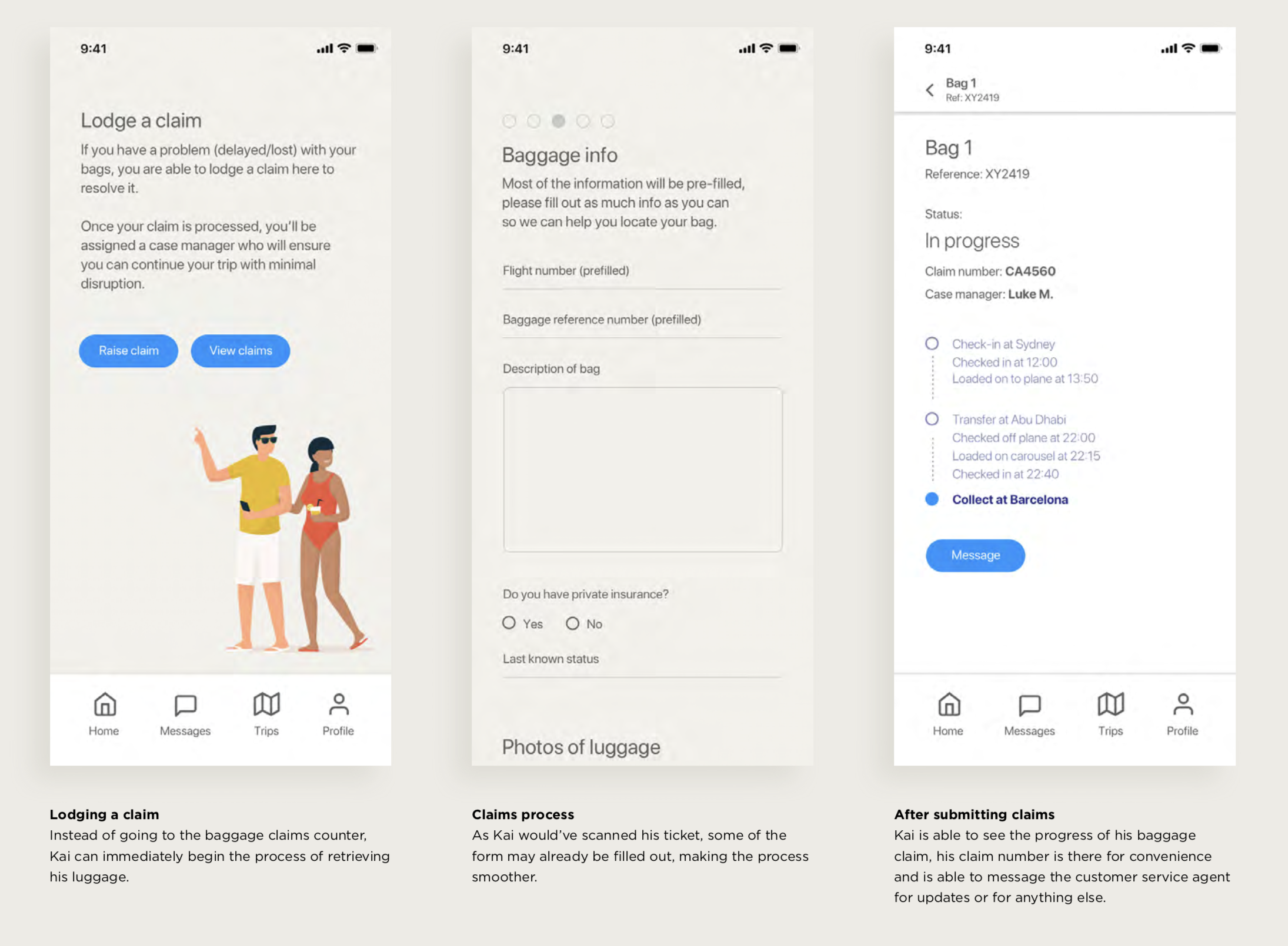
Case in Air streamlines the baggage reclaim process by digitizing the form and provides greater transparency on the status of relocating your luggage as well as a messaging service to baggage claim agents.
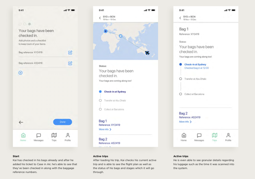
Scenario 1 – Check-in
Kai doesn’t travel often and is a nervous flyer, the last thing he needs to worry about is something happening to his luggage. See how Case in Air modernises the luggage check-in process and improve his travel experience.
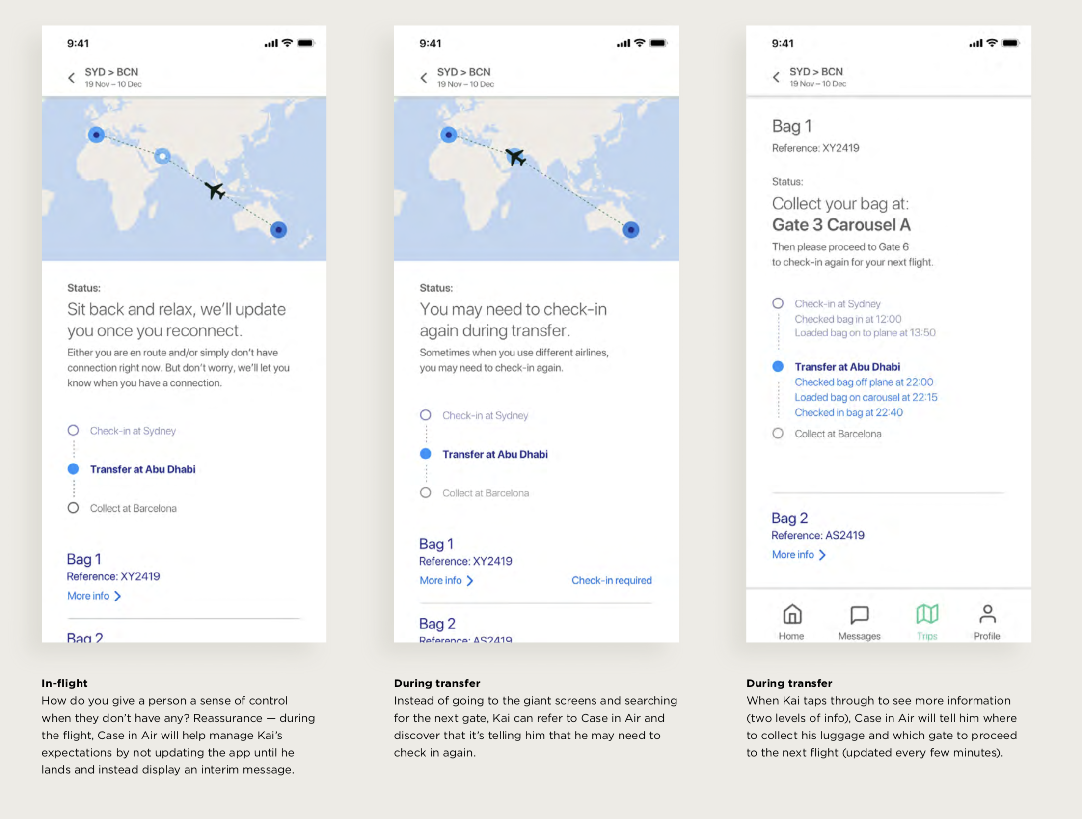
Scenario 2 – Connecting flight
Kai booked his flight with different airlines but isn’t sure if needs to check his bag in again. See how Case in Air improves the connecting process.
This scenario will also show what happens when Kai is using the app during the flight
Scenario 3 – Lodging a case
Unfortunately, Kai’s bag may have been delayed, traditionally, he would need to go to the baggage claim counter, request to fill out a claim form and then wait to be contacted when it is located. Case in Air streamlines this process and by pre-filling information from Kai’s scanned ticket and digitising the form.
Behind the scenes
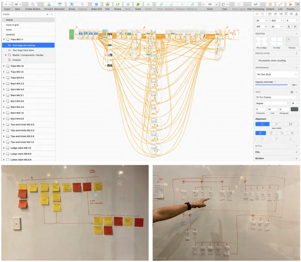
There were many software programmes that allowed one to prototype, some allowed for rapid prototyping while others facilitated a more high fidelity design. But learning about ways of organising your design file was insightful and important, and helped improved the ability for me to design quickly.
