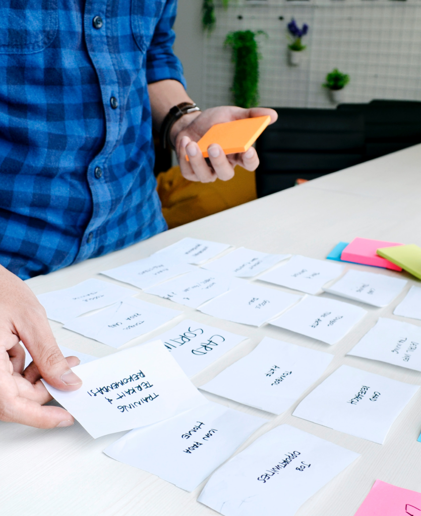
Stephen is a UX Designer with a foundation in creating and developing brand languages and emerging cross functional skills (with a weird fascination for product design systems and LEGOs…) He has executed print, digital and multimedia experiences from childcare centres to Australia’s largest personal transport organisation.
His drive in expanding his UX/UI skillset (defining the problem, researching, analysing the data and proposing the solution) is so that he can get to work with people that see design as an integral part of an organisation.
How did you get started in design industry? How did you get to where you are today?
There wasn’t a defining moment where I was sure of what I wanted to do. How I got into the design industry began when I was younger and I had an inclination towards the creative arts: I took drawing classes, learned how to play music and helped design the high school magazine.
While working in a customer facing role, I studied a general design degree at COFA (now UNSW Art & Design) where I conducted my first user-centered project around the usability of cutlery with children. Though, at the time, I was more interested in graphic design so I transferred to Billy Blue College of Design where I obtained my Bachelors in Communication Design. Again, I lead a user-centered project, this time it was focused around food waste produced by university students and was awarded a High Distinction.
After that, I got a job in a small design studio, learning the tricks of the trade under the stewardship of my Creative Director. During my second year, I began to take on digital projects (UI/UX), where I learnt how to manage a UI design file through design systems and because I had a general understanding of web development, I rolled out a website of a publicly-listed company.
Parallel to the roll-out, I took further study, enrolling in User Experience Design (part-time) at Academy Xi, which gave me the tools and processes to take on the digital projects at work and saved me a lot of heartache thanks to the practicality of the course as it was grounded in real-world examples.
From working in customer service, studying UX Design, having real-world experience, it’s time for me to make the natural transition from Communication Design and dive into the world of User Experience Design (that is not to say I won’t be using my graphic design skills anymore).
What transferrable skills have you learned in other jobs that have helped your career in design? How do you apply them?
The principles of design in Communication Design are largely the same as they are in UI Design, balance, hierarchy, contrast and even spatial awareness (in UI/UX Design, while 3-dimensional space is considered such as the physical environment, the digital 2-dimensional space is super important as it considers elements like the mental load of a user during interactions).
Some of the goals of a UX Designer is to anticipate user needs, reduce the number of questions customers have of a product/service and to provide a delightful experience, all this and some interpersonal skills, is exactly what I’ve learnt and delivered during my time in a customer service role.
What work/project are you most proud of?
I got the opportunity to work with one of the largest personal transport companies in Australia, this was a large undertaking, I designed a new logo, stationery as well as an iconography suite for the company as well as helping design the website and completed the roll-out of it. I learnt so much during this year-long project, from the logo design process, critiquing, the web development process, designer developer relations, technical knowledge etc.
The website was a challenge as it was previously handled by a separate team. The design was not up to scratch and nowhere close to being ready for launch, the client was frustrated, the relationship between the our studio and the developer was strained and there wasn’t a defined process, not to mention we were running against the clock. I came in and analysed the state of the project and the deliverables and the first step I took was to define a process necessary to deliver the website on time and to a high standard. I established a relationship with the developer, and together, reduced chances of miscommunication and improved the efficiency of the design to development procedure. During feedback sessions, I would create detailed briefs of the refinements and changes that needed to done and went further by setting up call meetings with the developer to run through the notes to make sure they understood the brief and it also provided an opportunity for them to ask any questions there and then, this also reduced chances of error and time wasted.
Eventually, the CEO and team were extremely pleased with the outcome, and the website went live without issues.
Was there a time when you have messed up and felt like you have failed? What did you do? How did you deal with it?
One of my first projects was designing the visuals for a childcare centre’s website, the wireframes had been approved and I was tasked to create the website brand experience. This was challenging due to the fact that I didn’t receive a handover and I wasn’t well versed in Sketch.
The first design iteration didn’t go as well as I’d thought, as I got caught up in learning how to use Sketch and how to organise my components. I drew inspiration from the wrong websites and the design felt sterile and uninviting to a target audience of parents and children.
I had already spent quite some time on the design, including receiving feedback from colleagues. But from my experience, I knew it wasn’t aligned with our customer base. So I went back to the drawing board, revisited inspiration from websites and businesses that work with children and redesigned the website and it turned out for the better.

What advice would you give to those just starting in the industry?
Make sure you have your foundational skills up to scratch (drawing, sketching and basic theory of design). Always look at inspiration and save them to whatever you use such as Pinterest, Behance or Dribble. And be open-minded and hear what people have to say.
Who are your mentors?
In relation to design, my previous Creative Director, Dan was my mentor and not only did I learn technical skills from him, but career tips and how to face the internal battles we face like “I don’t feel confident” or “I’m not good enough.” I’m grateful for his guidance and we still keep in touch.
Where do you find inspiration?
From using apps on my phone, Pinterest, Behance, Siteinspire, Instagram.


Do you have a “productivity hack”?
Not necessarily, look after your health, sleep early if you can. I find sketching and discussing briefs to another colleague can help generate ideas. There is a fine line between analysing and doing research and being bogged down in details.
What tools do you use on a regular basis?
Adobe Creative Suite, Sketch, Notebook pencils and pens, iPad or iPhone for recording, books.
What books/websites/podcasts would you recommend?
I highly recommend listening to Design Details, a podcast run by Brian Lovin and Marshall Bock, they are amazing and experienced UX/UI designers and will help make you feel calm and that everything will be ok when you’re feeling anxious at your job (at least that’s how they’ve made me feel) but most importantly give you tips based on their lived experiences in the industry.


