An app that wages war on atrophy, gives to charity, all the while promoting longevity and health in people over 40.
My background and bias
Before the start of Academy Xi’s ten-week transform course, I had an idea weighing on my mind. In my 20s and 30s, I had been fit and strong…stronger than most, and for a girl, I could lift heavy things very easily. I like to move my furniture around regularly for a change in my environment and had typically been able to do it on my own with some sliders or with someone else on the other end. Since I turned forty, I experienced a steady decline in the strength of my body.
“I could no longer hold up my end of the couch.”
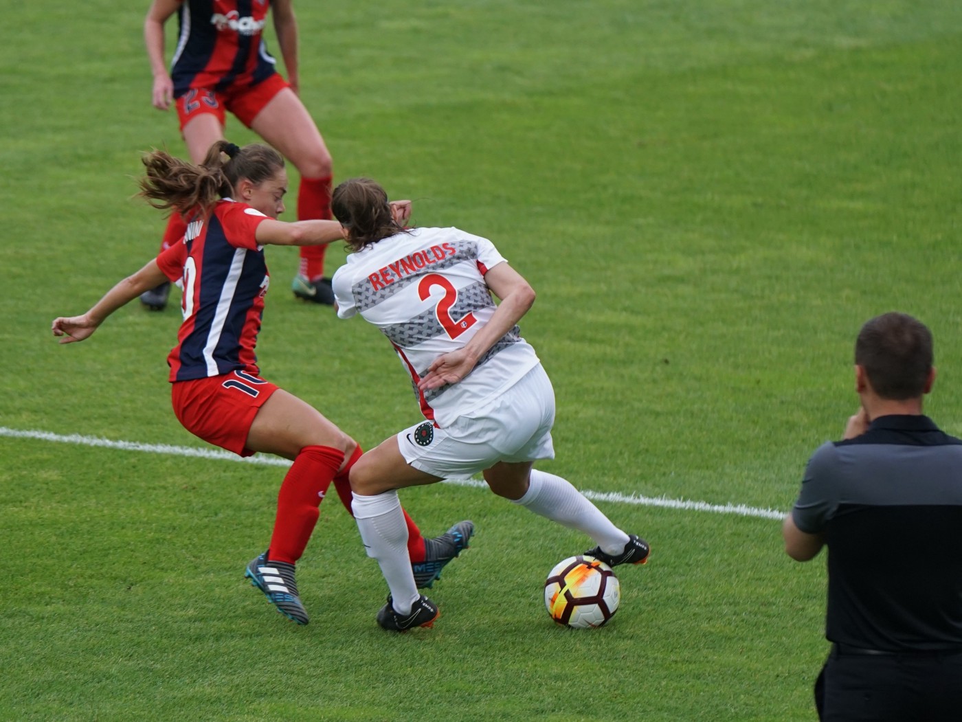
I also noticed a decline in my overall fitness and turned to running and short, efficient sprints via HIIT but could never get motivated enough to be consistent. It was boring and not fun. I then found a soccer team…now this was fun, and I got fit (not strong) quickly. The trouble was, all around my soccer buddies, also in their forties, were dropping like flies with injuries. Why did something so fun have to be so risky?
It was then my turn to be injured from soccer and I found myself at the physio for the first time in my life. My physio had reformer classes. Once I had worked through my injury in privates, I started going twice a week to the reformer classes.
It was then that I noticed my bodies old strength returning. I also found martial arts and wow did I enjoy that. You could not stop me from going twice a week…it was social, playful and fun. Still, when classes were not on in the holidays I tried to run to maintain my fitness…and then it dawned on me. I did not like running because it was not fun like soccer and martial arts and it did not give me the strength and vanity results like reformer. Motivating myself without the fun factor and the vanity factor was like walking through mud up to my thighs. I did not realise I had only stumbled on a small part of the problem.
Defining the problem statement
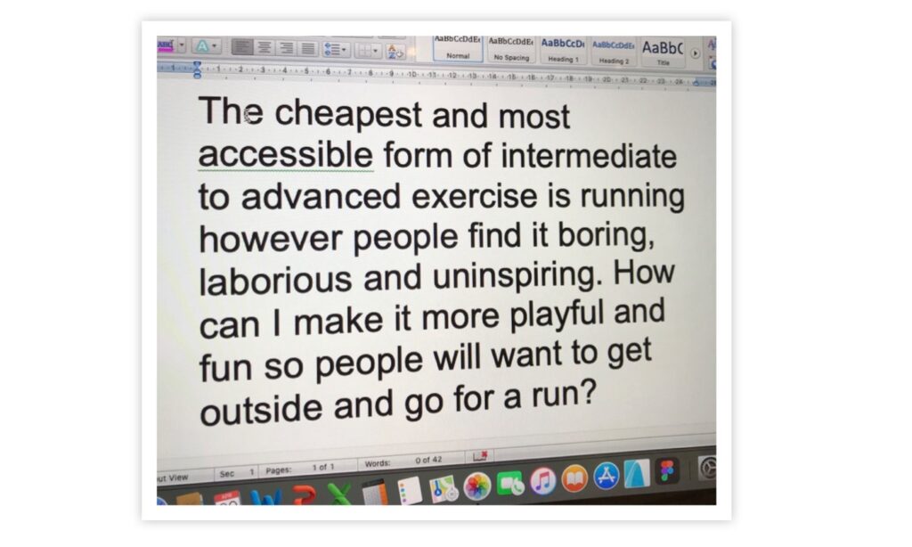
I set my incubation machine onto what I thought was the problem…the fun factor. How could I make running fun? At that stage, I thought ‘Under Armours Runtastic’ had the answer. Buried in the app and difficult to find were a series of poorly executed story runs. With headphones plugged in, I heard a story and using my imagination a run went very quickly; however, it was glitchy and frustrating to use. I found myself continually contacting Runtastic and asking them to improve and vary the story runs. No one listened. That was about the time I enrolled in Academy Xi and with my idea to create an app full of fun, playful, motivating fantasy runs I wandered into the classroom bright eyed and bushy tailed…oh so naive.
Prior competitor analysis
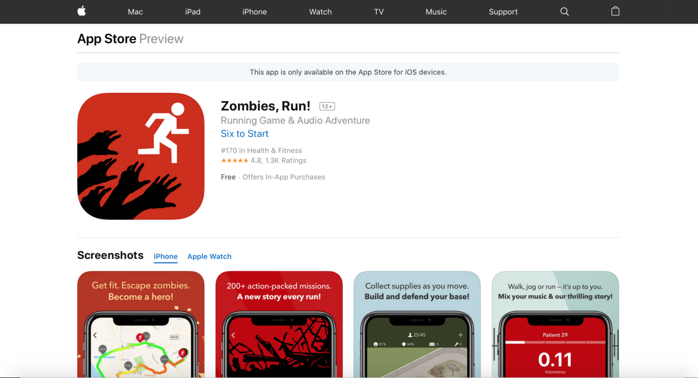
The first step I took to developing my idea was to look at other apps that had story running. The stand out app was Zombies Run which has a 4.8 rating in the app store and a lot of fans…I even found a couple of fans in my online survey. The downside is that if you are not into Zombies and thier revolting noises, which are in your face with headphones, it is so fricking scary. Plus you look like an idiot as you sprint with a terrified grimace on your face accidentally knocking over a toddler and getting tangled up in the lead of a yappy little dog. This is not for someone who is avoiding injury. As my good friend says, she would, “be more motivated and feel safer chasing George Clooney down the street than the living dead chasing her.”
“She would be more motivated and feel safer chasing George Clooney down the street than the living dead chasing her.”
Research
Rob Williams, my teacher at Xi, warned me about the dangers of hanging onto an idea before research and with that in mind I took to writing my first online survey with Survey Monkey.
Quantitative

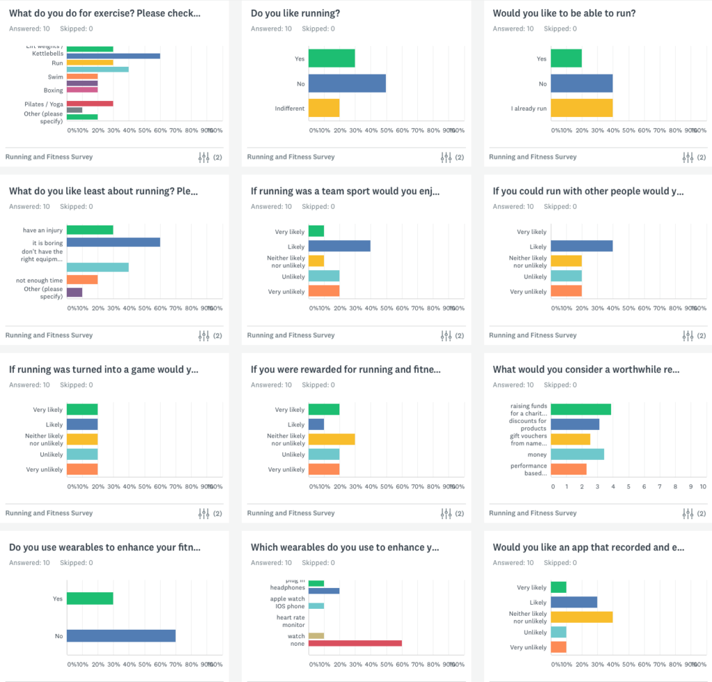
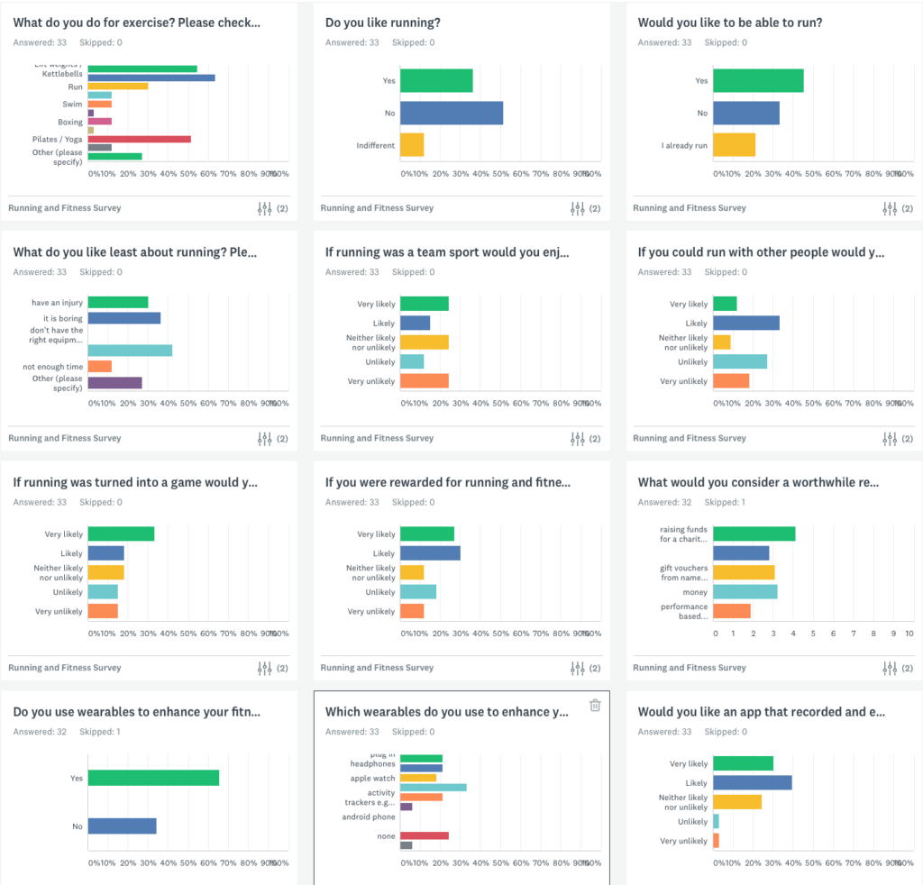
Wow, the results from this were tremendous! I realised I had stumbled on something…a big problem. I had 59 respondents, and all completed the survey in its entirety; however, 44 of my respondents were aged 35–54. A large chunk of people in my age group facing similar issues to what I had encountered.
Results in summary
People aged 35–54
…do weights/weight bearing exercises — I Identify!
…have favourite exercises…weights gives the best vanity and risk prevention results — I Identify!
…are prevented from specific exercise because of injury — I Identify!
…find running boring — I Identify!
…if running were a team sport they would enjoy it — I Identify!
…if running was more social they would enjoy it — I Identify!
…if they are rewarded for exercise they would be more motivated
…a worthwhile reward would be raising funds for a charity followed closely by gift vouchers, discounts and money
…wearables require further investigation, and this was not as popular in this age bracket as I assumed
…an app to track overall fitness offering a variety of strength and cardio options was desired; however this requires further investigation, and I did make assumptions in my final prototype design around this result. I based this design on Seinfelds “ Dont break the chain”
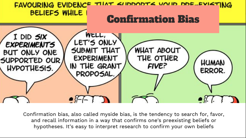
As we head further into the course and I learn more about research techniques I am concerned I have confirmation bias…that I am proving my beliefs. I need to relook at my assumptions from the beginning, and I realise while I identify with half of the results I actually was not consciously aware or seeking some of the results such as weight-bearing exercises. These came up in the written part of my survey over and over again as the exercise that gives the best results for vanity and injury prevention. I also had no idea that people are motivated by team sport and social exercise. I assumed it was a minority that were like me. Raising money for a charity was was not overly motivational for me either so I confirmed I was not too biased and determined to include the right features in the final design even if I did not find them relatable.
Qualitative
I need to start 1:1 interviews with my people so I can move away not towards my bias. I structure my interview questions trying to remove all bias.
I interview five people 41–47 years of age. Two are women, and three are men. In the end, I ask them a series of speed questions about feelings before, during and after exercise.
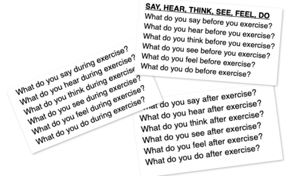
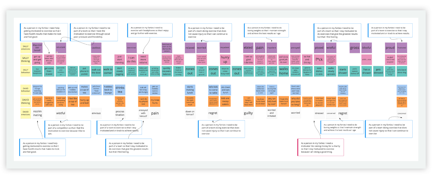
These answers assist me further with the customer journey and empathy map which I tracked after I affinity mapped and created personas.
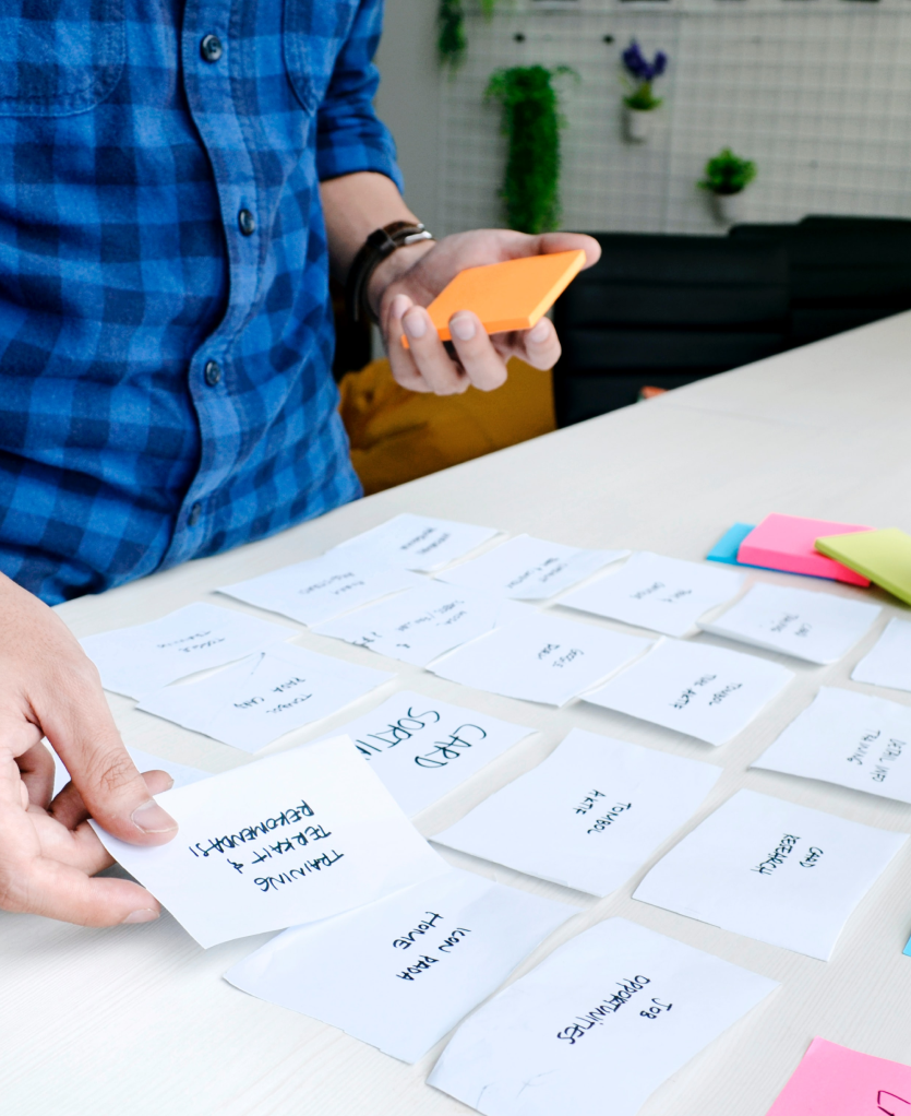
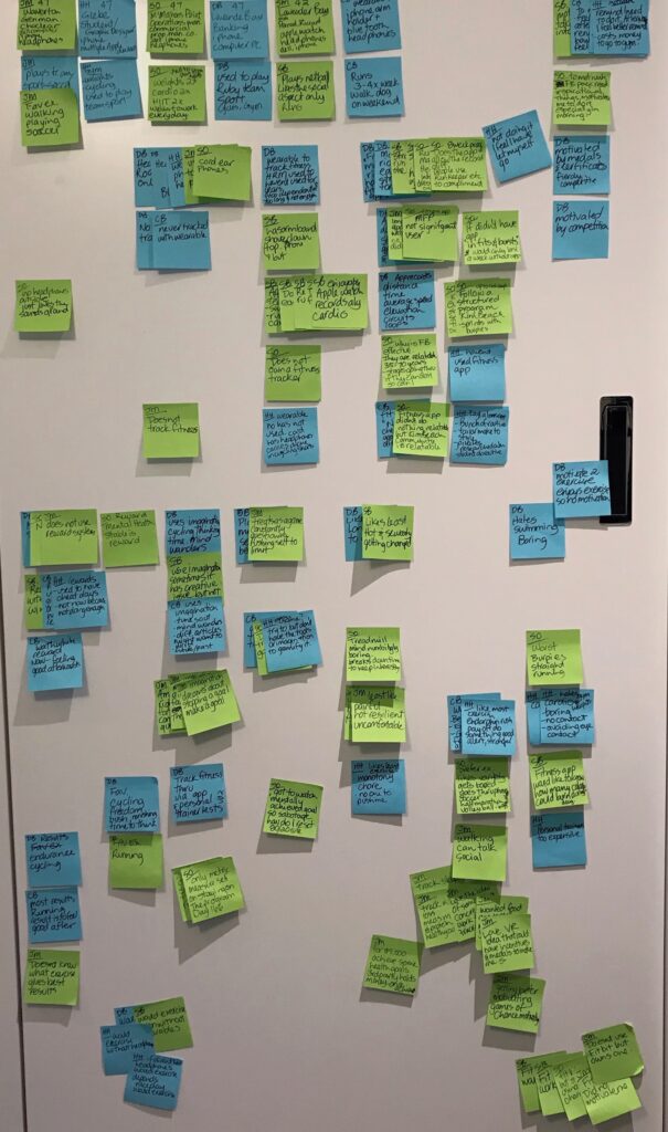
Affinity mapping
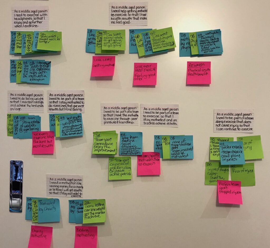
I start clustering and affinity mapping the results. I then seek to find my Insights. As a…I need…so that.
Insights
As a person in my forties I need…
…help getting motivated to exercise so that I have health results that make me look and feel good.
…to be part of a team so that I have the motivation to exercise through social peer pressure and friendship.
…to be part of a team so that I stay motivated to do exercises that give the greatest results but that I find boring.
…to be part of a team to exercise so that I stay motivated and on track to achieve results
…to be part of a team doing exercise that does not cause injury so that I can continue to exercise
…to exercise with headphones so that I enjoy and go further with exercise.
…to be part of a competition so that I feel the motivation to exercise because I like to win.
…to do boring weights so that I maintain strength and achieve the best results as I age
… a motivator like raising money for a charity so that I stay motivated to exercise because I am doing a good thing.
Revision
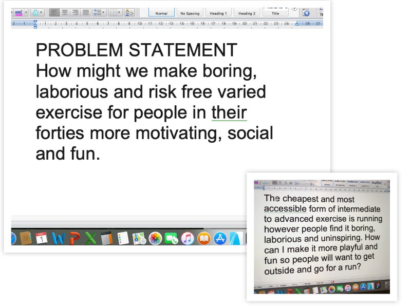
I revised my problem statement after affinity mapping to be less about running and more about exercise, injury prevention, social needs and still at the core ‘fun’.
Personas
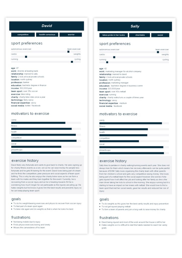
I create my personas, David 47 and Sally 42, modelled from 1:1 interviews.
Customer Journey
I pin the insights from the affinity mapping back to the pain points in my customer journey. The customer journey was modelled from the 10min speed questions in my 1:1 interviews.
The product and features
My product rapidly morphs from a fantasy running app to motivate people to run, to an app to motivate people in their forties to exercise. The premise behind the product is people who have these common needs can…
…register a team to compete. The need for competition and social needs is met by forming a team.
…raise funds for a charity. The need to give back or compete on a leaderboard is met.
…team meets and trains together at least one day per week. Commitment, motivation through peer pressure and social needs are met.
…for proof to donors the team commit to taking a selfie each week and upload it to social media with thier weekly results. The selfie keeps thier donors updated that the team is meeting thier minimum commitment to train together.
…individuals are encouraged to keep a calendar of thier exercising streak (number of days in a row). There is evidence that this can be motivating in forming micro habits to meet goals. Inspired by Seinfelds “don’t break the chain”.
…individuals are encouraged to include two weights/strength training sessions and two rest days for recovery per week. There is evidence that strength training and resting in a training regime can give the best physical results.
…the need to experience less injury is met by the option of partaking in less risky exercises that can be chosen based upon circumstances. Participants are encouraged through the articles page and the calendar page to include two strength based exercise days and two rest days of which there is evidence that this prevents injury.
MVP
I do not have access to software engineers and coders to know what is hard (expensive) and what is easy (inexpensive). My inexperience made this problematic, and I did not do it well. However, I can identify what are the essential features to include from my research.
Information Architecture
Very rough User flows, and site flows outlined with Chris Rusnak and Rob Williams. In the site flow I decided to focus on the dashboard and team pages not on the team sign up process.
Ideation
I work autonomously on ideation. Ideally, I would like to play ideation games with a team and client. When I work on a design independently in architecture, I need time for incubation to complete the process. I do not have much time for this because of the rapid speed of the course.
Usability testing
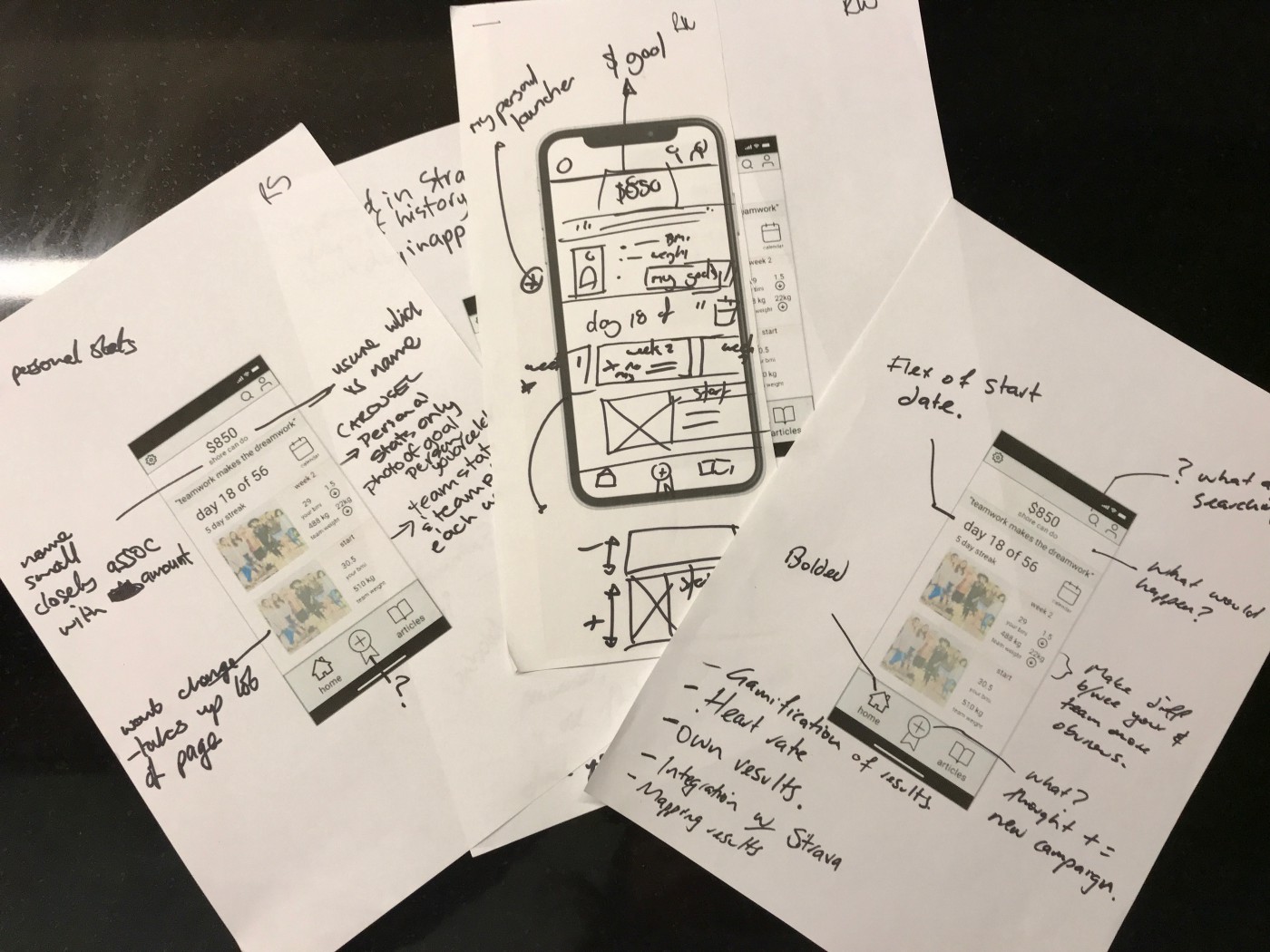
I tested four people. Three men and one woman. I used paper wireframes and seamlessly worked through them with each participant. I asked them to explain their understanding and to navigate and share their feelings. I also supplied each person at the end of testing with a page and sharpie and asked them “what would they like removed and deem unnecessary, what would they want to see on each page and how would they like it to be represented?”
What did I find?
What did I change?
How did it affect my project?
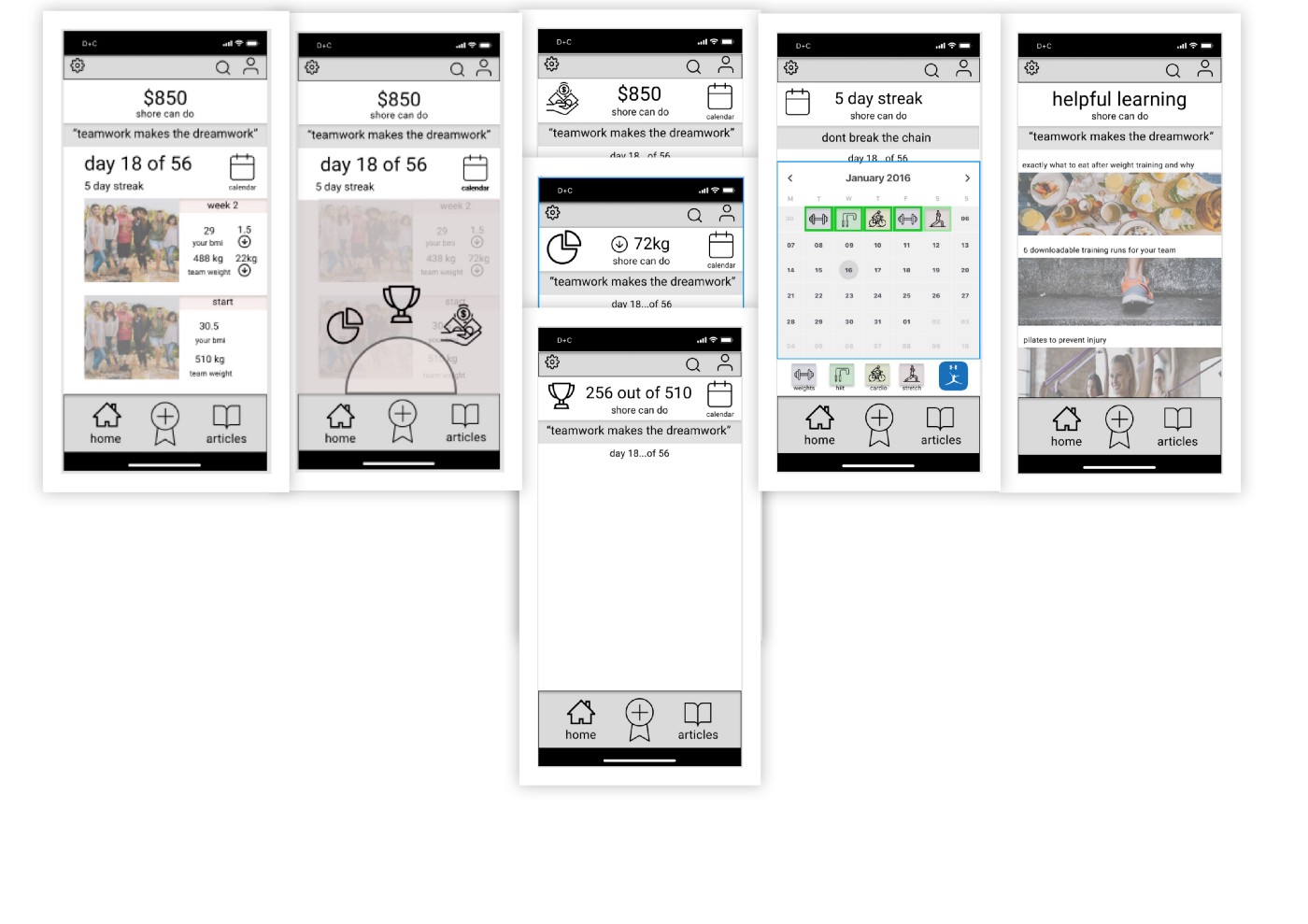
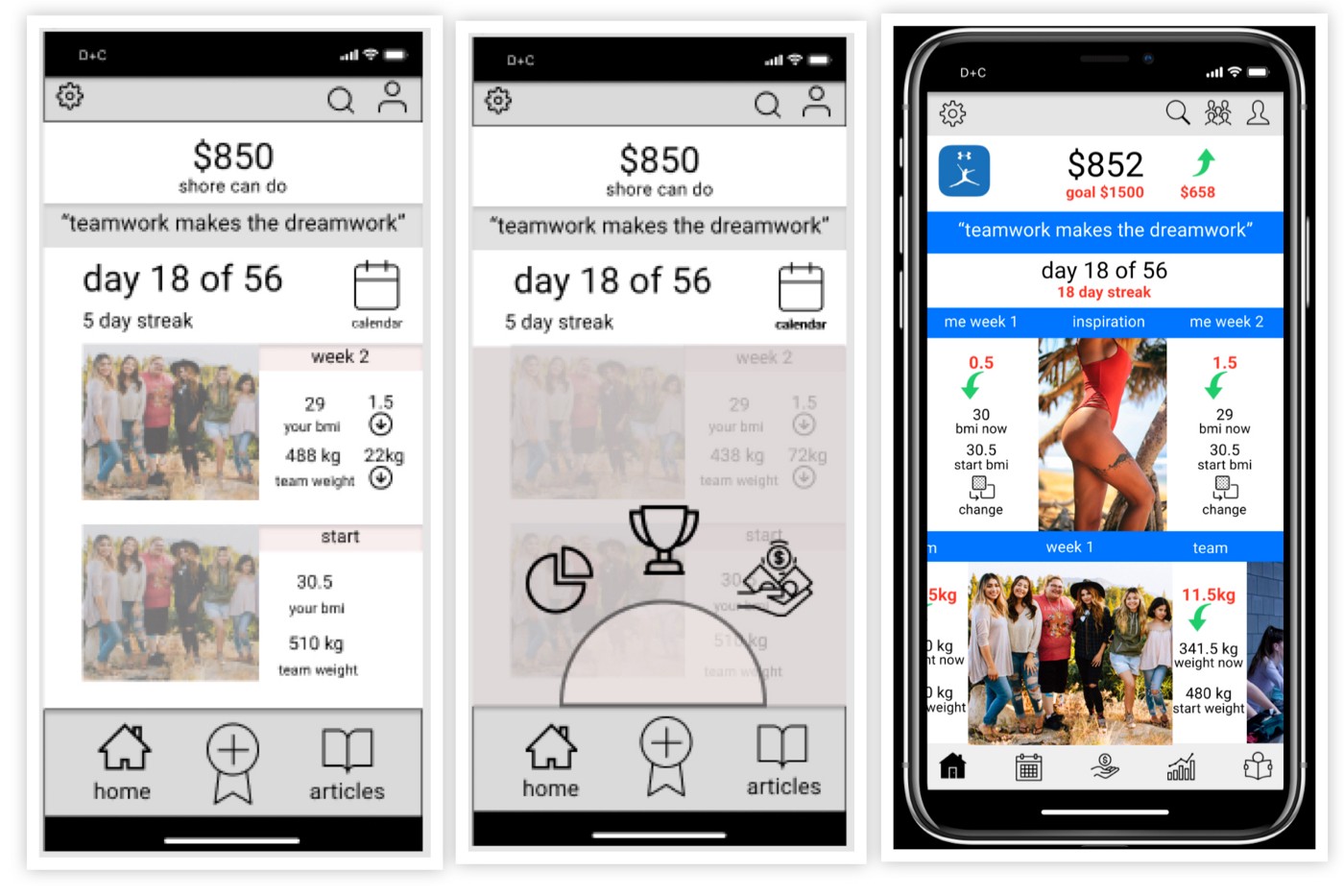
Dashboard page people wanted…
…to see their donations goal and how much to reach their goal
…wanted the motivational quote shown over all the pages
…overall weight loss of the team and a team selfie was received well
…wanted a carousel of the team selfies and results over the weeks
…wanted a section like the carousel team section for their statistics and an inspirational photo or picture showing their results from week to week
…wanted to be able to change their results to something that motivates them, e.g. waist measurement/Vo2/resting heart rate/weight/BMI
…wanted a team communications page shown top right on the revised page
…did not understand the ribbon symbol
…not sure of articles
…recognised 5-day streak and its meaning
Ribbon symbol greyed screen and further selections people wanted…
…did not understand this page as there was room on the bottom of the home page to fit all icons
…donations icon was understood and piechart as a statistics page
…Not sure what the trophy was — only one person guessed it was a leader board
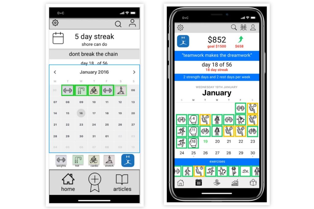
Calendar page people wanted…
…to see their donations goal and how much to go
…no team name necessary
…carousel through a greater number of exercises to put on the calendar
…inclusion of the rest day in the exercise options
…only one person got my fitness pal symbol as a partner app to record nutrition however this may have been the low fidelity of the wireframe
…too many navigation buttons all over the screen
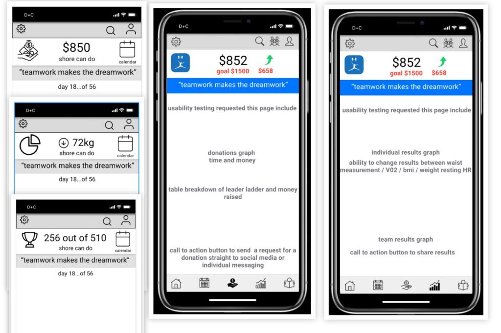
Donation page header people wanted…
…to see their donations goal and how much to go
…no team name necessary
…donations graph with time and money
…call to action button to send a request for a donation straight to social media or individual messaging
…Leader board page incorporated into this page
Statistics Page people wanted…
…to see their donations goal and how much to go
…no team name necessary
…individual results graph
…ability to change results between waist measurement/Vo2/BMI/weight/resting HR
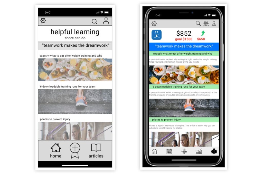
Photo of articles page people wanted…
…to see their donations goal and how much to go
…no team name necessary
…generally well received once they saw articles relevant to fulfilling their goal
…would like more text as to what each article is about
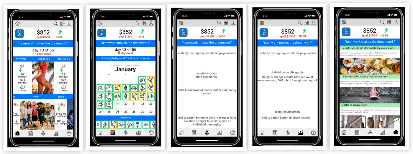
Overall people wanted…
…to see their donations goal and how much to reach their goal
…no team name necessary
…navigation reconciled in headers top and bottom and not spread all over the place
…more exercise choices
…more on personal stats
…ability to change individual results
Steps forward
…Design the sign-up and registration pages
…After registration refine the dashboard and subsequent pages
…Closed card sort of pages required for next testing to determine the features and content on the donations page and the statistics page
…Calendar, dashboard and news page card sort
…More wireframes after card sorting
…Further testing
Summary
Why should anyone care about my project?
The why of my product changed as I researched. It became increasingly about people’s quality of life and motivation to exercise as they age. By designing an app that ‘motivates’ people in their forties to do a variety of exercise by ‘fulfilling their desires’ socially, physically and mentally team fit is making people healthier.
Team Fit — An app that wages war on atrophy, gives to charity, all the while promoting longevity and health in people over 40.
Christina Wood
UX Researcher | UX Designer | Startup Investor

